Church t-shirt design ideas that actually print well — how to pick your message, type, shirt color, and ink so the design reads from the back row.
What makes a good church t-shirt design?
A good church t-shirt design does one thing well. Pick a single message, set it in type people can read from across the parking lot, and choose a shirt color that makes the ink pop. Simple designs print cleaner, cost less, and get worn more often than busy ones.
That's really the whole secret. I've printed a lot of church apparel over the years, and the pattern holds every time: the shirts that show up again on a random Tuesday are the simple ones. The ones with six colors and three fonts live in a drawer.
So this guide is about the craft side — the decisions that make a design work on fabric. If you're still gathering church shirt ideas for specific groups and ministries, start with our guide to church shirts and come back here when you're ready to design.
Nail the message before you touch the artwork
Almost every design that stalls stalls here. Somebody opens Canva first and starts pushing fonts around, and three weeks later there are eleven versions and no decision. Write the words down first — the artwork gets easy once the message is settled.
One idea per shirt
Your church name, your theme for the year, a verse, the event, the date, and a mascot is six ideas. Pick one, maybe two. If the youth group is going to camp, the camp name and year is plenty — the rest is noise that shrinks your type.
With verses, shorter is stronger
A long verse set small is unreadable on a shirt and hard to print cleanly. Pull the phrase that carries the weight and put the reference underneath in small type. Three to six words reads from a distance. Twenty-five doesn't.
Say who you are, not just what you believe
Shirts that name the church, the ministry, or the trip get worn more than generic faith graphics — because they mean something to the person wearing them. A shirt that says *Redeemer Student Ministry* is a memory. A shirt with a stock cross graphic is just a shirt.

Typography that reads from the back row
Type does most of the work on a church shirt. Get it right and you barely need graphics at all — some of the best modern church t shirt designs are nothing but well-set words.
Two fonts, maximum
One display font for the headline and one clean font for the supporting line. That's it. Pair a heavy font with a light one so they don't fight each other. Three or more fonts almost always reads as cluttered, even when each one is nice on its own.
Size for distance, not for your screen
A design looks enormous zoomed in on a laptop and tiny on an actual chest. A standard adult front print is about 11 to 12 inches wide, and your main line should own most of that. Print your mockup at full size on paper, tape it to a shirt, and back up ten feet. You'll spot the problem in two seconds.
Give the letters room to breathe
Tight letter spacing and thin strokes are where prints fall apart, especially on heathered fabric. Thin serifs break up, and letters that nearly touch can bleed together. When in doubt, go bolder and looser than feels necessary.
Shirt color and ink — the part most people get wrong
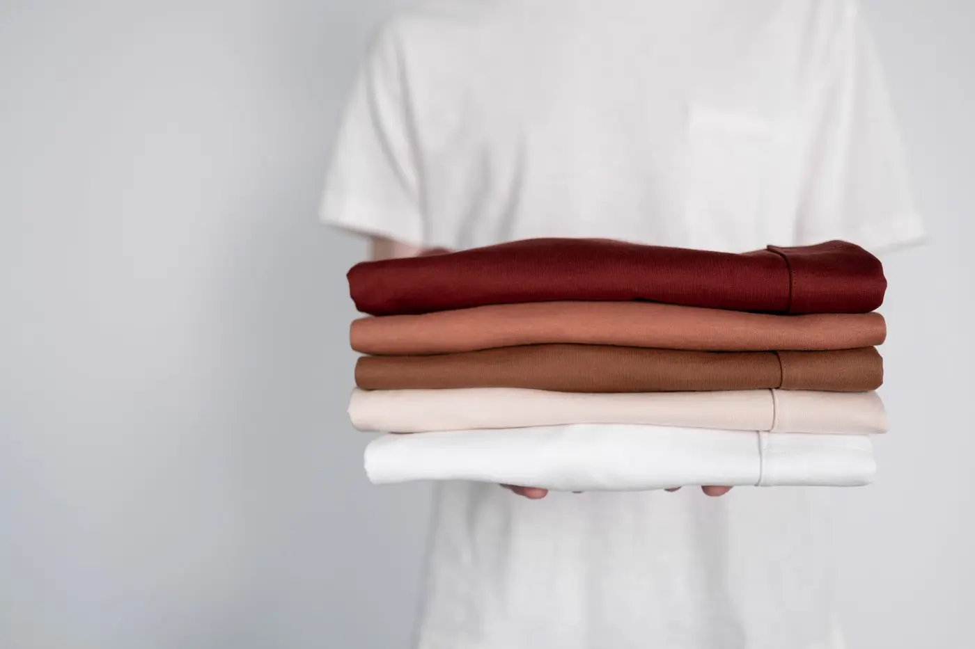
Here's the one I'd fix first if I could only fix one thing. Most people design the graphic, then pick a shirt color at the end. Do it backwards. Choose the shirt color first, then design ink that contrasts hard against it.
Contrast beats cleverness
Cream ink on a heather navy tee reads beautifully. Gold ink on a tan tee looks great on a screen and disappears in a sanctuary. Squint at your mockup — if the words go mushy when you squint, the contrast isn't there yet.
Light ink on dark shirts needs an underbase
Printing white or a light color onto a dark shirt means laying down a white underbase first so the color doesn't sink into the fabric. That's a normal part of screen printing and we handle it — just know it counts as a color, so it can nudge the price on a dark-shirt run. Worth it, and worth knowing up front.
Heathers and tri-blends shift your colors
Heathered fabric has a slubby texture that softens fine detail and mutes ink slightly. It's a great look — very popular with student ministries right now — but design a little bolder for it. Save your hairline details for a smooth 100% cotton tee.
Five design styles that work for churches
If you're staring at a blank page, pick a lane first. These five cover most of what we print for churches and ministries, and each one has a different feel.
1. Modern minimal
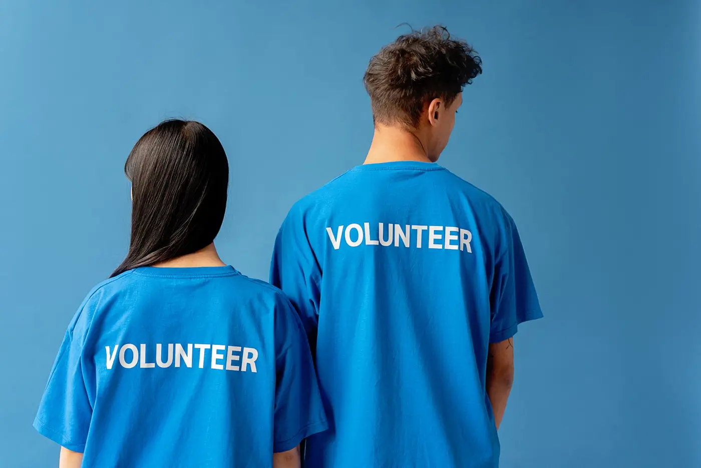
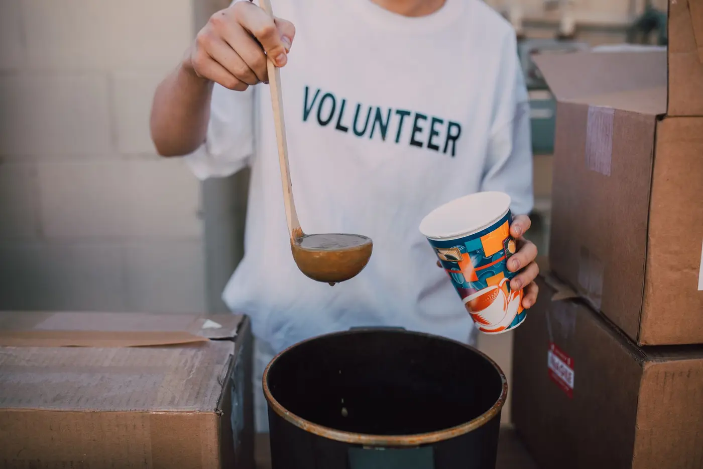
A single line of clean type, small, left chest or centered. Usually one ink color. Reads as understated and current, and it's the cheapest to print. This is what I recommend most often for staff and volunteer shirts.
2. Vintage and retro
Warm, faded palettes, arched text, a slight distress on the ink. Very popular for camps, retreats, and youth events. The worn-in look is forgiving too — small imperfections read as intentional.
3. Big bold type
One word or a short phrase blown up huge across the chest. High impact, dead simple, and it photographs well — which matters when you're posting event pictures.
4. Illustrated or mascot
A drawn icon, a mountain range for a retreat, a mascot for a kids ministry. More personality, more colors, a bit more setup. Great for merch people actually want to buy.
5. Left chest plus back hit
Small logo on the front, the bigger message on the back. This is the workhorse layout for volunteer and greeter shirts — approachable from the front, clear from behind when someone's walking away.
Design for the decoration method
This is the piece most design guides skip, and it's the one that decides whether your file actually works. Each method has a sweet spot.
Screen printing — bold designs, bigger runs
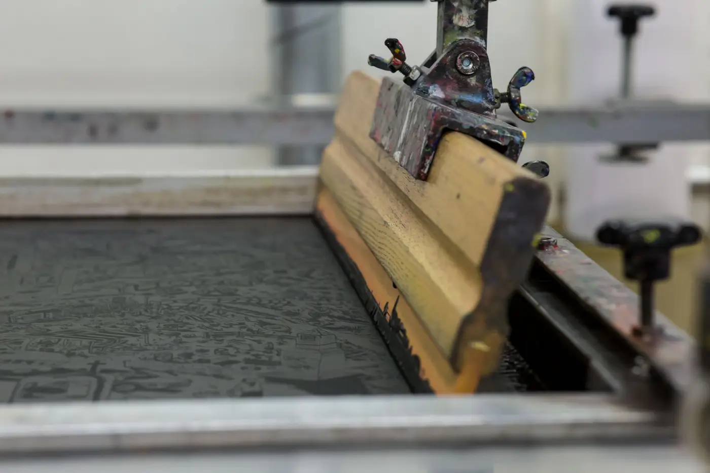
Screen printing pushes ink through a mesh screen, one screen per color. It gives the softest, most durable print and the best price once you're past a couple dozen shirts. Design in solid spot colors and keep the count low — every extra color is another screen. Two or three colors is the sweet spot for most church runs.
Embroidery — polos, hats, and staff wear
Embroidery stitches the design in thread. It looks sharp and lasts basically forever, so it's the right call for pastor polos, staff quarter-zips, and hats. But thread can't hold tiny detail — simplify the logo, drop text under about a quarter inch, and expect gradients to become solid blocks. If your design has fine linework, print it instead.
DTF — full color, small batches, no minimum stress
DTF printing transfers a full-color print onto the garment. Unlimited colors, gradients and photos are fine, and there's no per-color setup — which makes it the honest answer for small quantities. If you need twelve shirts for a mission trip with a detailed illustration, DTF beats screen printing on both cost and hassle. For a deeper comparison, we broke down embroidery vs. screen printing separately.
Get your file print-ready
Nothing delays an order like artwork that can't be used. A few things save everyone a round trip:
Send vector when you can. An AI, EPS, SVG, or PDF from vector software scales to any size without going fuzzy. If all you have is a raster file, send it at 300 DPI at full print size — not a 600-pixel logo pulled off a website.
Outline your fonts before sending, or send the font file along. Otherwise the type reflows on our end and it won't look like your mockup.
Use a transparent background. A white box around your logo will print as an actual white box. And if you're color-matching to a brand standard, send us the Pantone numbers so we can hit them exactly.
If your artwork isn't there yet, that's normal — send whatever you have. We'll tell you straight whether it'll work, and we can clean it up or redraw it.
Want a hand with your church's shirts?
Send us your idea — a sketch on a napkin, a Pinterest screenshot, a half-finished Canva file, whatever stage you're at. We'll come back with a free mockup and a straight quote, and we'll tell you honestly which method fits your design and your quantity, even when that's the smaller sale.
We're based in Mesa and print for churches all over the Phoenix area and nationwide. Get in touch whenever you're ready — no pressure either way!
Frequently asked questions
- How many colors should a church t-shirt design have?
- One to three for screen printing. Each color is a separate screen, so the count drives your setup cost. One or two colors looks clean and modern and keeps the price down. If you genuinely need full color or a gradient, DTF printing has no per-color charge, so use that instead.
- What is the best shirt color for a church t-shirt?
- Whichever one contrasts hardest with your ink. Heather navy, charcoal, and black are the most forgiving with light ink, and cream or natural works beautifully with a dark print. The rule that matters: squint at your mockup, and if the words go mushy, change the shirt color.
- How big should the design be on a church shirt?
- A standard adult front print runs about 11 to 12 inches wide, and a left chest hit is usually 3 to 4 inches. Print your mockup at actual size, tape it to a shirt, and step back ten feet — that tells you more than any measurement.
- Should church shirts be embroidered or printed?
- Print your t-shirts, embroider your polos and hats. Embroidery looks sharp on staff wear and lasts forever, but thread can't hold small text or fine detail. Printing handles detailed artwork and costs less on tees. Plenty of churches do both — printed event tees, embroidered staff polos.
- What file format do you need for a church t-shirt design?
- Vector is ideal — AI, EPS, SVG, or a vector PDF. If you only have a raster image, send it at 300 DPI at the size it will actually print, with a transparent background and the fonts outlined. Not sure what you have? Just send it and we will take a look.
- How many church shirts do we have to order?
- It depends on the method. Screen printing gets efficient from about 48 pieces up, because the setup spreads across the run. DTF has no color setup at all, so small batches of a dozen make sense. If your numbers are unpredictable, an on-demand store removes the guesswork entirely.
- Can you help design our church shirt if we do not have artwork?
- Yes. Send a rough idea, a reference photo, or just the words you want on it and we will put together a mockup. Most of the church designs we print start as a sketch or a screenshot, not a finished file.
Outfitting your church?
Send us your logo, verse, or rough idea and a headcount. We'll mock it up for free and send a quote — no commitment, and no one on staff has to become a shirt expert.
Get a free church mockup